
You Don't Need a Better Dashboard. You Need Your Numbers to Come Looking for You.

There is a report in your business right now that would change a decision you are about to make. It might be the class that is filling at half the rate of the one next to it. It might be the twelve families who booked last spring, never came back, and nobody has messaged. It might be the venue that looks busy and quietly loses money every Thursday.
You could find any of it in about four minutes.
You won’t, though — not because you don’t care, and not because the data isn’t there. You won’t because it’s Tuesday, the 4pm class needs setting up, a parent is asking about a make-up session, and looking at numbers is the thing that gets done after the urgent things, which is another way of saying never.
This is the part of reporting nobody writes about. Not which metrics matter — we’ve written about that, and so has everyone else. The unsolved part is who does the looking. Because for the last twenty years the answer has been “you, voluntarily, in your own time” — and that has never once worked at scale.
It doesn’t have to be the answer any more. That’s what this piece is about: moving reporting from something you visit to something that arrives, checks itself, and only interrupts you when it should.
Part 1 — Why reporting fails in small businesses
It’s a visiting problem, not a data problem
Every booking system you have ever used had a reports tab. Most of them were fine. The failure happens one step earlier: dashboards are pull-based — they sit and wait for a human to remember them.
That’s not a children’s-activities problem, it’s universal. Industry surveys of business intelligence adoption have landed in roughly the same place for years: only about a quarter to a third of the people with access to a paid business intelligence tool actually use it. Forrester’s analysts have spent years arguing about what replaces the dashboard, and the honest summary is that the chart was never the problem — the ritual of going to look at it was.
Now shrink that to a business with eleven instructors and no analyst. The person who would open the dashboard is the person teaching. There is no reporting culture to fix, because there is no reporting shift — no hour in the week that belongs to it.
The value of a number decays, fast
The BI researcher Richard Hackathorn described something he called the value-time curve: from the moment a business event happens, the value of responding to it drops away with every hour that passes. He broke the delay into parts — how long before the data is captured, how long before anyone analyses it, how long before a decision, how long before an action. Every stage burns value that you can never get back. (Later writers extended it into “action distance” — the total gap between information existing and something being done about it.)
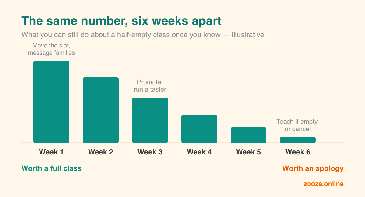
For a seasonal business, that curve is unusually steep. Consider what a slow-filling class is worth to you at different moments:
- Week 1 of enrolment. You can move the time slot, split the age band, message last year’s families, send a targeted offer. The information is worth a full class.
- Week 3. You can still message, still promote, still run a taster. Worth maybe half a class.
- Week 6. Term has started. You can teach it under-filled or cancel it and upset four families. The information is now worth an apology.
Same number. Same report. The only variable is when it reached you — and in almost every business that number sat in a database the whole time, perfectly accurate, completely unread.
The businesses that close the gap do measurably better
This isn’t only a comfort argument. AWS’s research into small and medium businesses found that highly data-driven SMBs are roughly twice as likely to report positive outcomes across the things that matter — revenue (65% versus 34% of their less data-driven peers), customer satisfaction (69% versus 37%), process efficiency, cost control — and that the gap between the two groups is widening rather than closing.
Read that carefully, though. It isn’t “buy analytics software and grow 23%”. Almost every business in the study already had the data. The difference was whether it reached a decision in time to change it.
So the practical question for the coming season is not what should I measure? It’s: what has to change so that the numbers reach me without me having to go and get them?
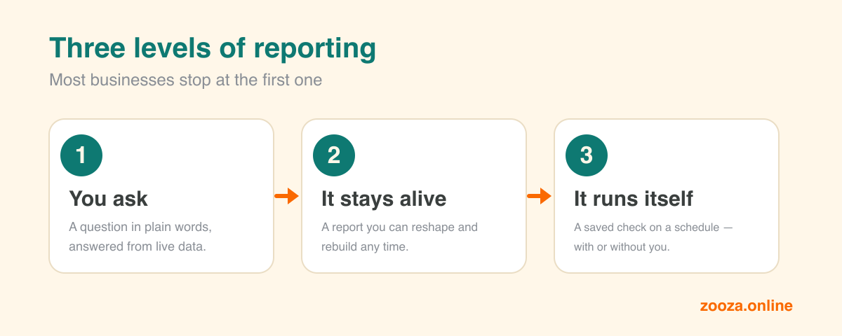
Part 2 — Three levels of reporting, and why most people stop at the first
Level 1 — Ask, and get an answer
The first level is the one most people now know: you ask a question in plain words and an AI assistant connected to your booking system answers it from your live data.
“Which classes are under 60% full for the autumn term?” — twenty seconds, no report builder, no spreadsheet, no export.
We wrote about this in detail when it launched: build your own custom reports from Zooza data by just asking. It’s genuinely useful and it’s where almost everyone stops.
It’s also still pull-based. You have to think of the question. On the Tuesday you don’t think of it, you get nothing.
Level 2 — The report that stays alive
The second level is small but changes the feel of the thing: instead of an answer in a chat, you get a report artifact — a proper, laid-out view that opens beside the conversation. A colour-coded occupancy grid. A term-over-term retention comparison. A venue-by-venue revenue table.
Two things make an artifact different from a screenshot:
- You can rebuild it. Ask for it again next week and it’s regenerated from live data, not refreshed from a stale export.
- You can change its shape by talking to it. “Split that by venue.” “Show me last term next to it.” “Sort by the biggest drop.” Each of those takes a sentence, not a rebuild.
There’s a non-negotiable rule underneath this, and it’s worth checking your own setup against it: every figure in the report must come from your system verbatim. An AI that estimates a number rather than reading it is worse than no report at all, because it’s wrong in a way that looks right. Zooza’s connector is built so the assistant has to pull real figures before it can draw anything — occupancy, unpaid, churn, attendance, trials, retention, make-up credits, clients by location — and cannot fill in a gap with a plausible guess.
Level 3 — The report that runs without you
This is the level almost nobody in our sector has switched on yet, and it’s the one that actually solves the visiting problem.
Both major assistants now run saved prompts on a schedule:
- Claude supports scheduled recurring tasks — hourly, daily, on weekdays, or weekly — on paid plans. Crucially, a scheduled run has access to the same connected tools you use in a normal conversation, so a scheduled task can reach your booking data the same way you can.
- ChatGPT has scheduled tasks on paid plans, with limits on how many you can keep active and how often they can fire.
The mechanics take five minutes. The shift in behaviour is the whole point: Monday at 07:00, the report exists whether you remembered it or not.
The upgrade most people miss: don’t ask for a report, ask for an exception
Here is where it gets genuinely powerful — and where most people set it up wrong.
If your scheduled task sends you a full weekly report, you will read it for three weeks and then start skipping it, exactly the way you stopped opening the dashboard. You have moved the ritual, not removed it.
The version that survives contact with a busy September is exception reporting — an old management idea, now trivially easy to implement:
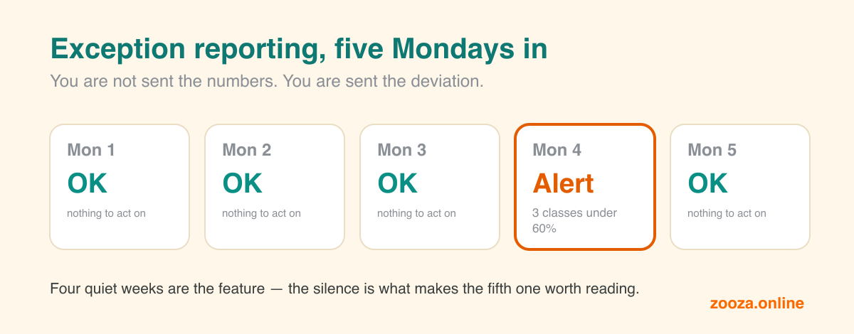
“Every Monday at 7am, check autumn enrolments. Don’t send me a report. Only message me if a class is below 60% full with fewer than three weeks to start, if any class has lost more than two enrolments since last week, or if unpaid registrations are above 15% of the total. If none of those are true, just reply OK.”
Most Mondays you get “OK”. That’s the feature, not a bug: it costs you two seconds and it means the silence is informative. When something does arrive, it has earned your attention.
Two warnings from every industry that has done this before you:
- Alert fatigue is real and it’s the main failure mode. Monitoring teams have learned the hard way that too many alerts produce exactly the same outcome as no alerts — people tune them out. Start with two or three rules, not twenty.
- Thresholds need a baseline, not a hunch. “Below 60% full” is only meaningful if you know your normal. Our benchmark data puts typical class occupancy around 54% across European providers — so a rule set at 80% will scream at you every week and teach you to ignore it. Set the first threshold at roughly your own recent average, then tighten it once you know how often it fires.
Part 3 — The report that changes next year, not next week
Everything above is operational: fill the class, chase the payment, spot the drop. Worth doing, and it pays for itself in a season.
But there’s a second kind of report that almost no activity provider runs, and it’s the one that changes how you plan. It comes from looking at cohorts rather than segments.
The distinction is simple and matters more than it sounds:
- A segment is a snapshot of a group right now — everyone unpaid, everyone at the Riverside venue, everyone in the 4–6 age band.
- A cohort follows the same defined group over time — the families who first joined in autumn 2025, tracked through winter, spring and into this autumn. Mixpanel’s explanation puts it well: a cohort combines an event and time, so you’re always watching the same people.
Segments tell you what to do on Tuesday. Cohorts tell you what your business looks like in a year.
What it looks like when you run it
The table below is illustrative. It is a composite — deliberately rounded, assembled to show what this analysis typically looks like rather than taken from any one business’s books. The digits are not the point. The shape is, and the shape repeats.
Take a provider with roughly 1,800 families in their database, a few weeks into enrolment for the new term. Instead of asking “how many have signed up?”, they group everyone by how that family last touched the business, then ask what share of each group has booked.
| Where the family last was | Group size | Booked the new term |
|---|---|---|
| In class last term | ~900 | ~33% |
| Short holiday course only — never a full term | ~200 | ~35% |
| Trialled once, never enrolled | ~250 | ~6% |
| Away one term | ~300 | ~6% |
| Away two terms or more | ~150 | ~2% |
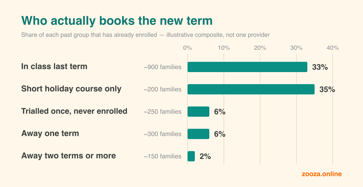
That table takes an afternoon to build by hand and about a minute to build by asking. And it says three things a headline enrolment number can never say.
1. The short course is an acquisition channel, not filler revenue. A family who has only ever done a one-week holiday course books the new term at roughly the same rate as a family who was with you all last term — from a much weaker relationship. That is a striking result, and it reframes what short courses are for. They are not a way to keep the lights on between terms; they are the cheapest route to a new full-term family that you already own. The obvious move for next year is to run more of them, earlier, and treat them as a funnel rather than a filler.
2. Dormancy decays fast — and knowing that is worth money. One term away and the conversion has already collapsed to a fraction of the active group. Two terms away and it is close to nothing. Not zero, but low enough that a re-activation campaign to the long-dormant list is a poor use of the two weeks you have before term starts. Knowing a channel is dead is worth as much as knowing one is alive, because it frees the effort for something with a pulse. (If those rows bother you, the fix isn’t a better email — it’s the term-to-term drop-off that created the dormant list in the first place.)
3. The ceiling you can’t see: your cohort is ageing. This is the finding that changes planning rather than marketing, and almost nobody runs it. Take any past group and ask a different question — not “will they come back?” but “could they even fit?” Every provider has an age range their programmes cover. A share of every cohort ages out of it each year, and that share is invisible in every other report you have. If a large part of a group will be too old for your current offer by next season, then your ceiling next year is not a retention problem you can fix with better communication. It is arithmetic, and there are only two answers: build the next programme up the age ladder, or accept that you must replace that share with new families every single year.
Run that once and you stop planning next year from optimism.
One caveat on cohorts, and it’s the standard one: don’t over-slice. Cut the data too finely and your groups shrink to a handful of families, where one enthusiastic parent looks like a trend. Analysts have a plain rule for this — if a cohort gets so small that a single person moves the percentage noticeably, it isn’t telling you about your business any more. Four or five meaningful groups beats twenty precise-looking ones.
Part 4 — The prompt pack
This is the part to steal. These work with any assistant connected to your booking data; the wording is deliberately plain.
A good reporting prompt names four things: the period, the comparison, the shape, and the threshold for action. Most weak prompts are missing the last two.
Before and during enrolment
“Show me autumn occupancy by class as a table, sorted from emptiest to fullest. Mark anything under 60% in red, and put last autumn’s figure for the same class next to it.”
“List every registration created in the last 7 days, grouped by programme. Compare it to the same 7-day window last year.”
“Which of our trials this month converted to a paid enrolment and which didn’t? Show the conversion rate by programme and by instructor.”
The weekly rhythm
“Pull unpaid registrations for the autumn term. One row per family, oldest first, with how many days overdue and the amount. Total at the bottom.”
“Show attendance for the last four weeks by class. Flag any class where attendance has fallen for three weeks in a row.”
“How many unused make-up credits are outstanding, by programme? Tell me which programmes are carrying more make-up demand than they have spare capacity for.”
The once-a-term questions
“Compare retention from last term to this one, split by age group. Where is the biggest drop?”
“Show me clients by location. Which venue is growing and which is shrinking term over term?”
“Build the cohort table: for families whose last term was spring, winter, or last autumn, what share has booked this autumn? Show it as a table with group size, number booked, and percentage.”
The scheduled ones
Set these as recurring tasks rather than typing them:
“Every Monday 7am: check autumn enrolments. Reply OK if everything is normal. Message me only if any class is under 60% full within three weeks of starting, or if any class lost more than two enrolments in the last week.”
“Every Wednesday 8am: check unpaid registrations. Only tell me about families more than 14 days overdue, and draft a friendly reminder I can review before it goes out.”
“First working day of each month: give me one short paragraph — new registrations, cancellations, occupancy and unpaid, each compared to the same month last year. No charts, just the paragraph.”
By discipline
- Swim schools: “Show occupancy by pool and by time slot. Which slots are consistently under-filled, and are they the same ones as last year?”
- Dance studios: “Which age bands lose the most students between terms, and at what age does drop-off start?”
- Language schools: “Compare retention for courses that run a full year against short blocks. Which produces more revenue per family over 12 months?”
- Music schools: “Show attendance by instructor for the last term, and flag anyone whose classes have below-average attendance three weeks running.”
- Football and sports clubs: “Which venues have the highest cancellation rate, and does it correlate with the day of the week?”
Two practical notes. First, some of these are direct report views your system can hand over immediately; the deeper cohort questions may need an export the assistant then works from — ask and it will tell you which. Second, read the first version of every scheduled report before you trust it. Check one number against your own records. Once it matches, you can stop checking.
What to do this week
Not a strategy. Three things, roughly twenty minutes:
- Ask one question you’ve been guessing at. Probably: which classes are under-filled for autumn, with last year next to them. See what comes back.
- Turn one question into a schedule. Monday 7am, exceptions only, two rules maximum. Set the threshold at your current average, not your ambition.
- Run the cohort table once. Where did this autumn’s families actually come from? Whatever surprises you in that table is next year’s plan.
The reporting problem in small activity businesses was never that the numbers were hard to produce. It was that producing them required you to stop teaching, remember, log in, and look. That requirement is now optional — and the businesses that drop it first will spend this season making decisions on Monday that everyone else makes in November.
Zooza connects to Claude and ChatGPT, so you can ask for any of the above in plain words and get it back built from your real figures — never estimated ones. It’s included with any active Zooza account. See how it works.